Good modern business website design is clean, fast, and built around what your visitors need to know. If your site buries your services, loads slowly, or looks outdated, visitors leave. And they rarely come back.
To make matters worse, web standards have shifted over the past five years. And most business owners don’t realize their site hasn’t kept up until clients start going elsewhere. Keep in mind, your website is your company’s first impression, and visitors make up their minds pretty quickly.
This article covers layout, messaging, design trends, UX standards, and the features visitors now expect to find. If your site is missing any of them, you’re leaving clients on the table.
Let’s get into it.
The Real Requirements of Modern Business Website Design

A business website has one job: turn visitors into clients. Most sites fail at that job, not because of poor design taste, but because they get the basics wrong.
These three areas decide whether your site converts visitors or loses them.
- First Impression: Visitors form an opinion about your business within seconds of landing on your site. Just seconds. And if the design feels cluttered or outdated, they won’t stick around to search through your pages.
- Visual and Functional Balance: Modern business website design works best when appearance and functionality support each other. When those two elements work together, visitors trust your site faster and stay longer. High-performing sites don’t have accidental design choices.
- Clear Service Communication: Your site needs to present your services in plain language, with no jargon and no buried pages. If visitors have to search hard to figure out what your business does, most of them won’t wait around to find out.
Every design decision should point visitors toward one thing: taking the next step with your business.
How Website Layout Influences the User Experience
Website layout drives the user experience by controlling where visitors look, what they find, and how long they stay. So, if you get it wrong, visitors will leave without another glance.
Let’s discuss the layout decisions that affect that opinion most.
- Poor Layout Consequences: Our experts share that users decide whether to stay or leave a site within 50 milliseconds. That’s how much weight a website’s layout has on visitors. A clear visual hierarchy, with your most important content at the top, keeps visitors engaged long enough to hear your message.
- White Space: White space is one of the most underused tools in web design. It separates ideas, reduces visual noise, and guides the reader’s eye toward what you want them to notice. Plus, when your pages have room to breathe, your content feels clean, readable, and more professional.
- User Expectations: Users form habits from the sites they visit most. They expect logos top left, navigation across the top, and contact details in the footer. When your layout breaks those patterns, visitors feel disoriented and start looking for the exit. So we always suggest that you put your services where people instinctively look for them.
All in all, good layouts do one thing above everything else: they get out of the visitor’s way.
What Good Web Design Does for Your Messaging

Good web design makes your message impossible to miss and easy to trust. Most business owners invest in their services and marketing. Yet they push website copy and design aside as an afterthought, and that disconnect is obvious to potential clients.
When your design and messaging are out of sync, visitors get mixed signals about what your company does. What’s more, confusing signals make people run. That’s why your visual choices should reflect your brand identity across every touchpoint.
From our experience, companies that communicate clearly online treat web design and writing as a single process. When those two things work together, your site becomes a far stronger tool for winning potential clients.
Website Design Trends Worth Paying Attention To
The trends worth following are the ones that make your site easier and more enjoyable to use. And right now, creative teams are moving toward layouts that feel dynamic and intentional, because your audience notices the difference when a site feels current.
Two trends in particular have moved well past the fad stage.
Dark Mode and How It Affects Readability
Dark mode is no longer a novelty. Most devices and browsers now offer it as a standard display option, and a growing number of users keep it on permanently. That shift has real implications for your website design.
Color palettes behave differently in dark mode, and contrast ratios change in ways that catch most designers off guard. For instance, colors that look sharp on a white background can become surprisingly difficult to read against a dark one.
A quick dark mode test on your site often reveals contrast and readability issues that are easy to fix once you spot them.
Color Palettes That Work for Business Sites
Color is one of the first things visitors register when they land on your site. And the right combination builds brand recognition, signals professionalism, and creates a consistent feel across every page of your site.
When your palette reflects your brand identity and stays consistent across every page, your site feels more professional to someone visiting your website for the first time. And over time, that color consistency builds real brand recognition, and a site people recognize is a site people trust.
Of course, a great color palette only goes so far. The key features your site offers are what visitors interact with next.
Professional Website Features Visitors Expect Today
Professional websites today include fast load times, mobile design, and clear contact options. The truth is, most visitors won’t call your business to ask for information they couldn’t find on your site. They’ll simply leave.
These are the features that count.
- Load Times and Broken Links: Slow load times and broken links do serious damage to visitor trust. Google’s research shows that when page load time grows from one second to three, 32% of visitors leave without reading a thing. And every broken link or delayed page leaves potential clients with the wrong impression.
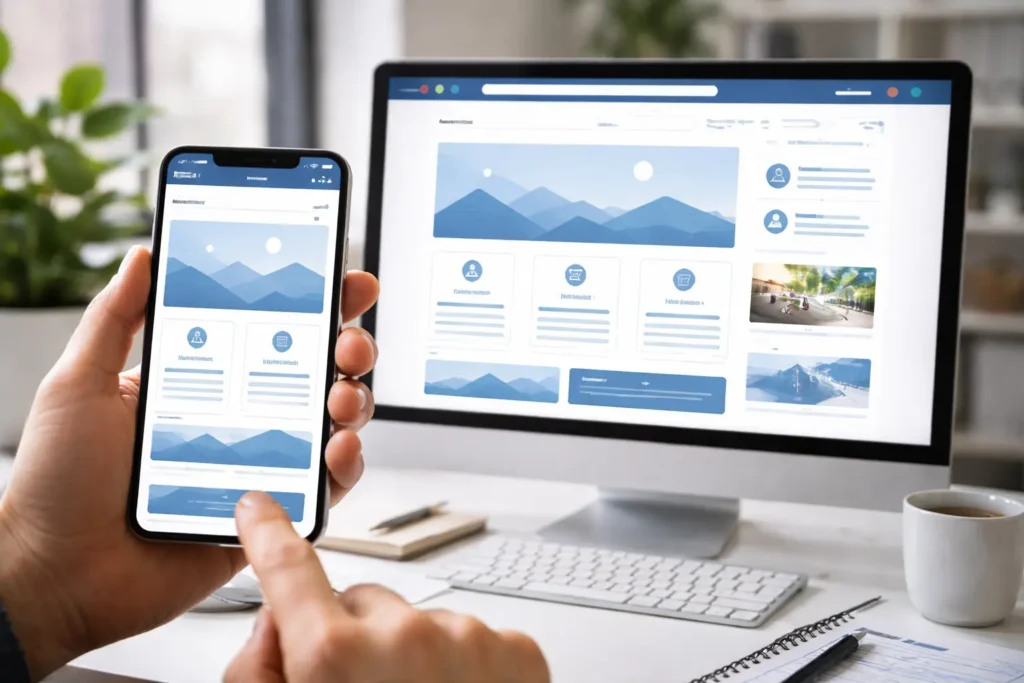
- Mobile Functionality: Most users browse on mobile. That means a site that isn’t built for mobile doesn’t just frustrate visitors, it actively hurts your search rankings too. Every page, form, and image needs to work correctly on a small screen to avoid both problems.
- Contact Forms and Calls to Action: When contact forms and calls to action are easy to find, casual visitors are more likely to reach out. Simple, but often overlooked. Especially for e-commerce businesses. So every page on your site needs to make it obvious what the visitor should do next.
A site that frustrates visitors at every turn will always lose them to a competitor whose site makes things easier.
Website UX Standards That Have Become Non-Negotiable
Features tell you what a site has, but UX defines how well those features work for the people using them. And the gap between features and experience is where most business websites lose visitors.
Small friction points are often the culprit. Unclear page flows, missing progress bars on multi-step forms, and slow-loading images all create moments of frustration that push visitors away before they convert. Most of these issues don’t show up during a casual browse and only become clear when you look at the data.
Beyond individual friction points, there are broader performance standards worth knowing about. Google’s Core Web Vitals set a measurable benchmark covering load speed, visual stability, and interactivity, and those scores feed directly into your SEO rankings.
Performance isn’t the only standard your site needs to meet, either. Web accessibility guidelines require that your site’s content stay usable for people with disabilities, and that requirement applies to business websites of every size.
From our experience, businesses with strong search rankings don’t just build a good site and walk away. They review page flows, check load speeds, and update content regularly to stay ahead of shifting visitor expectations. Your site deserves the same attention.
Time to Audit Your Website
A business website is often the first real interaction a potential client has with your company. Thus, first impressions stick. When a site underperforms, the business loses clients. And solving that issue starts with an honest look at exactly where your site falls short.
This article covered layout, messaging, design trends, UX standards, and the professional features visitors now expect. These areas work together. Each one affects how well your site performs and how visitors perceive your business online.
Your site deserves a proper audit. Emaglink Web Design is ready to help, and our team will walk you through every step you need to bring your web presence up to the standard your business deserves.
Your next client is already searching!