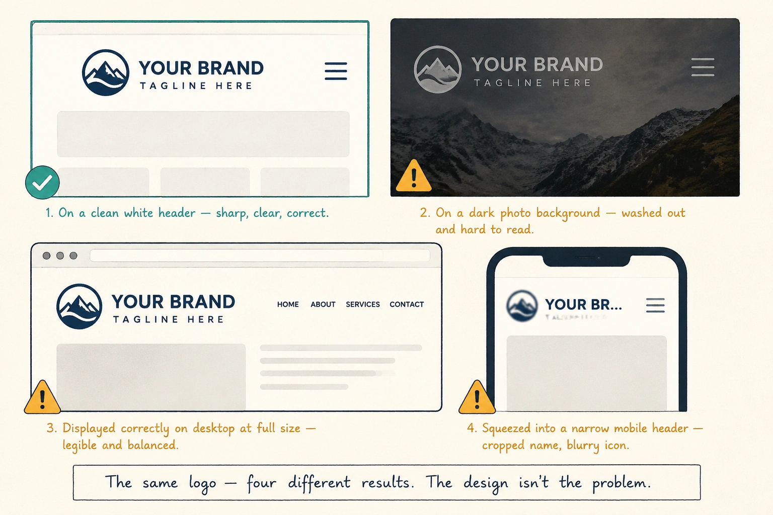
A good logo can look wrong on a website if it’s too small or feels out of place with the rest of the design. For example, a luxury fashion logo wouldn’t fit the look of a website designed for budget running shoes.
But that’s only one way a good logo can look wrong online. In many cases, the problem isn’t the logo itself but how it’s being used on the website. Below, we’ll look at some of the most common reasons this happens and how to fix them.
Let’s dive in.
Your Logo Might Be the Wrong File Type
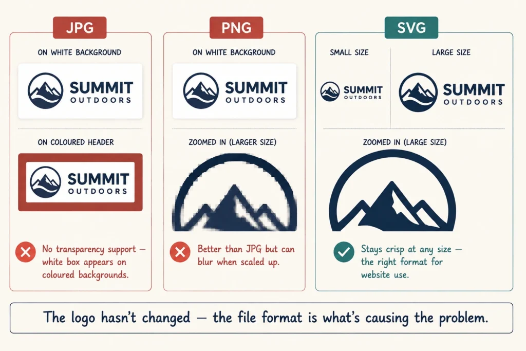
Sometimes, you can upload a perfectly good logo without realizing the file format isn’t quite right for your website.
Take JPG, for instance. You can use it on a plain white page without a problem, but JPGs don’t support transparent backgrounds. Put the same file on a colored header, and a white box might suddenly appear around it instead of a clean result.
Now, you might think the solution is to resize it. Unfortunately, that can create a different problem, since stretching a small file larger can make the design look blurry or pixelated.
If you’re running into either of these problems, try switching to SVG. This format stays sharp when you resize it, so you won’t get the same pixelation you see with a small JPG or PNG. If that fixes the problem, it means your original file wasn’t suitable for the way your website was using it.
A Busy Background Can Wash Out Your Logo
A good logo can lose its impact when the website puts the wrong background behind it. One that looks great on a clean, light background can get lost over a photo or pattern. The design hasn’t changed, but the background has made it harder to see clearly.
Transparency can make this problem worse. When the file has a transparent background, you can see whatever color sits behind it. For example, a white version can lose contrast against a bright header. As a result, it may not look as sharp as it did in the original design.
The same thing happens when the logo and background are too similar in color. A light version on a light background, or a dark one on a dark background, has little contrast and can easily blend into the page. Try placing it on a simpler, higher-contrast background and see whether it looks sharper and easier to spot.
Screen Size Changes How Your Logo Actually Looks
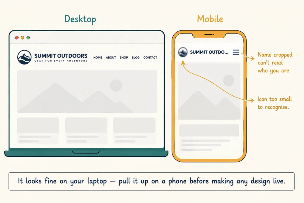
One of the main challenges is making sure your logo works across different screen sizes. It might look fine on desktop but become cramped, cropped, or difficult to read on smaller screens. Mobile makes this even more important, as it now accounts for more than 65% of web traffic.
Two issues in particular can make even a well-designed logo look wrong.
1. Mobile Can Squeeze a Wide Logo
Say you run a business called Coastline Family Dental. On desktop, your logo has plenty of room to stretch out, the full name, the icon, all of it sharp and legible. Shrink that same header down to a phone screen, though, and there’s often not enough space for the whole thing.
The layout usually handles it one of two ways. It crops part of your business name, or it shrinks the logo until the icon becomes a blurry shape next to half a word. Either way, the result is the same: someone lands on your site and can’t even read who you are.
2. A Shrinking Header Can Cramp Your Logo
Many sites shrink the header once someone scrolls, which frees up space but leaves less room for the logo. It may look balanced at the top of the page but become cramped or distorted once the header gets smaller.
It’s easy to miss this because your logo may look perfectly fine on your own laptop. In fact, when we audit client sites, a squished or cropped logo is one of the first things we catch.
So before you make any design live, pull up your site on a phone and scroll through a few pages. If it looks off there, you’ll know the mobile header needs attention.
A Cluttered Header Can Crowd Your Logo Out
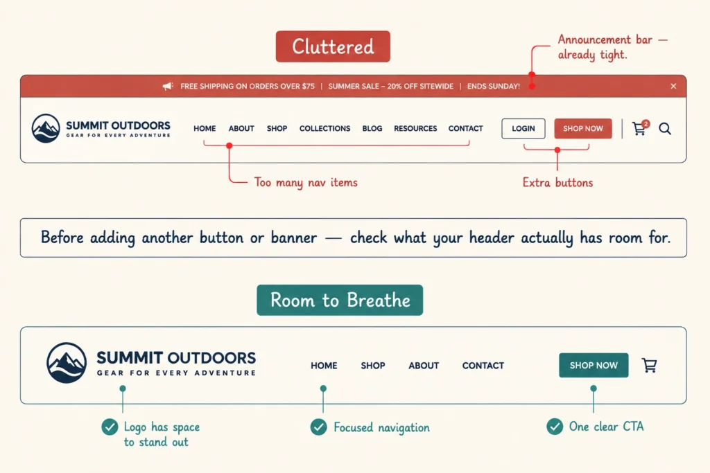
Your logo isn’t the only thing competing for space in a header. Navigation, buttons, and other elements can quickly crowd it out. Here’s what to look for:
- Long Navigation Menus: A menu with too many items can leave your logo squeezed into a narrow corner, especially when the business name is long. It might need to shrink just to keep everything on one line.
- Extra Header Buttons: When too many visual elements sit beside the logo, the header becomes crowded and pushes it into the background.
- Announcement Bars: A promotional bar above the header adds another element to the top of the page. If the header is already tight, this extra layer can make the logo feel cramped, or the whole top section look cluttered.
This kind of clutter is a user-experience problem as much as a visual one. Before adding another button or banner, it is worth checking what your header actually has room for.
A Good Logo Deserves a Website That Shows It Off
None of the problems covered here means your logo design needs changing. A wrong file format, a clashing background, a cramped mobile header, or a cluttered top bar are all fixable without altering the design itself. Once you know what to look for, most of these issues take minutes to spot and not much longer to fix.
And if you’d rather have someone else check it for you, Emaglink Web Design can review how your logo holds up across screens, backgrounds, and headers. Contact us for a free consultation, and we’ll help identify what’s making it look wrong.
Frequently Asked Questions
If your logo still doesn’t look right after checking these issues, you may need to look beyond the website itself. These questions can help you decide what to do next.
Should I get a new logo or fix my logo design?
Once the design looks good in the original files, try fixing how it’s displayed first. A new one may not solve a problem caused by the file, background, screen size, or header.
When is professional logo design worth it?
Professional logo design makes sense when the logo itself has problems with readability, balance, or scalability across different uses. If the design works everywhere except your website, the issue may lie with the site instead.
Can brand identity design help my logo work better online?
Yes. Brand identity design establishes how your logo, colors, fonts, and other visual elements should work together across your website and other platforms.
Where can I download my logo in the right format?
Ask your designer for web-ready versions in SVG and PNG, along with any specific variations you need. Keep the original design files too. That way, you can create new versions later without rebuilding the logo.
Should I use a brand kit for my website?
Yes, if multiple people work on your website or you regularly create marketing materials. A brand kit keeps your approved logo files, colors, fonts, and variations in one place, so everyone uses the correct versions.