Slow loading times, confusing layouts, and missing trust signals are some of the main reasons visitors leave websites within seconds. These issues create immediate doubt and make it harder for people to understand or trust what they’re seeing. So they move on to another site.
Fortunately, these problems are usually easy to identify and fix once you know what to look for. Below are the most common reasons why users leave websites so quickly and what you can do about them.
Let’s start with the most frustrating one: load speed.
Your Site Loads Like It’s 2005
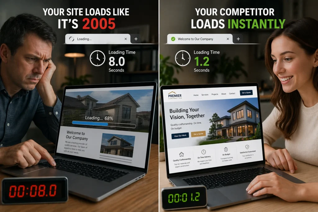
If your site loads slowly, visitors will likely leave before they see anything. In fact, research from Google shows that 53% of visits are abandoned if a page takes longer than 3 seconds to load (though most users expect sites to load almost instantly).
One of the main causes of slow load times is unoptimized images. A single high-resolution image can add several seconds to your load time and slow down your site before visitors even see the headline. Large files also force browsers to work harder, which affects overall performance across the entire page.
To fix this, start by compressing images before uploading them using a tool like TinyPNG. You can also improve load speed by enabling browser caching for repeat visitors and testing your site with tools like Google PageSpeed Insights. This tool shows exactly what is slowing your site down so you can optimize the right elements.
Mobile Users Can’t Read or Click Anything
Mobile devices now account for 66% of all web traffic, according to Similarweb. But if users can’t read your text or tap your buttons, that traffic doesn’t convert.
On non-optimised sites, text appears too small to read without zooming, layouts break across the screen, and buttons are difficult to tap accurately. When users have to pinch, zoom, or repeatedly hit the wrong element, they leave within seconds.
The solution is simple. Test your site on an actual phone to see what mobile users experience. If text is hard to read, elements overlap, or buttons feel too small to tap comfortably, your mobile layout needs adjustment.
Visitors Have No Idea What You Do
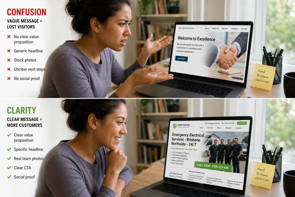
Visitors decide very quickly whether a website is relevant to them. If they can’t immediately understand what your business offers or why they need you, they’ll move on to another result. This confusion usually comes from a few common issues on the page, including unclear headlines, missing credibility signals, and a lack of clear next steps.
Vague Headlines Confuse Your Target Audience
Generic headlines like “Welcome to Our Site” tell visitors nothing about what the site offers. In contrast, specific, outcome-driven headlines immediately communicate who you serve and what problems you solve. For example, “Brisbane Web Design That Converts Visitors Into Customers” is far clearer than “Professional Services Available.”
Missing Trust Signals Hurt Credibility
Visitors often look for customer testimonials, reviews, and real client photos to decide whether they can trust your business. Without these trust signals, your site feels unproven and potentially risky to engage with. That’s why social proof like “We’ve helped 200 Brisbane businesses increase website engagement” reduces hesitation far more than generic claims.
No Clear Path Forward Means They Bounce
Every page needs an obvious next step, such as “Book a Free Consultation” or “Request a Quote.” Otherwise, visitors hesitate because it’s unclear what action they should take. And that hesitation often leads to higher bounce rates and missed opportunities to convert interested visitors into customers.
Your Navigation Feels Like a Maze
Can visitors find your contact page or service details in under three seconds? If not, your navigation is costing you traffic. Complex menus with too many options force visitors to think harder than they want to. When your navigation lists 15 links or buries important pages three clicks deep, many people give up before finding what they need.
This frustration often appears when visitors try to complete simple tasks, like finding a phone number or checking product pages. A cluttered navigation makes your site feel harder to use than it should be.
We recommend simplifying your navigation instead. Limit your main menu to five to seven clear options and add a search bar for quick access. Then use internal links to guide visitors to important pages naturally. That way, your visitors can find what they need without getting lost.
Pop-Ups and Auto-Play Videos Ruin First Impressions
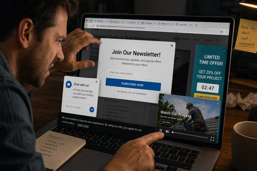
Imagine you click on a page you want to read. Before the content even loads, a pop-up covers the screen asking you to subscribe, then a video starts playing in the corner. You’re still trying to find the article, but now you’re closing overlays and muting tabs just to see what you came for. Frustrating, right? That’s how visitors feel when a website interrupts them too early.
Here’s how these interruptions hurt you:
- Immediate Pop-Ups Block Access: Visitors leave within seconds rather than hunting for tiny close buttons, especially on mobile, where the buttons are hard to tap accurately.
- Auto-Play Videos Drain Resources: They consume bandwidth and slow down page load times, particularly when loaded through third-party scripts.
- Early Interruptions Damage Trust: Users assume you care more about conversions than their experience, which hurts credibility before they read a single word.
If you must use pop-ups, delay them by at least 30 seconds so visitors see your content first. Better yet, skip them entirely and let the content do the work.
Fix These Issues Before You Lose More Customers
You now know the common reasons visitors leave websites before seeing what you offer. Each of them damages the user experience and increases bounce rates, which can hurt your visibility in search results.
But the good news is that these problems are fixable. Start by reviewing your site with tools like Google Analytics or Google Search Console to see where visitors drop off. From there, focus on improving load speed, mobile responsiveness, and clear messaging so your content matches what users are actually looking for.
If you need help improving your site’s performance and keeping visitors engaged, Emaglink Web Design can help. We build websites that load fast, work well on mobile, and guide users naturally toward taking action.