
You want your products to look as good online as in person. Then you publish a batch of photos, and the hero shot turns blurry on customers’ phones. A blurry hero shot is weak website image quality in action, and weak visuals cost you sales.
Clients bring us blurry hero shots all the time at Emaglink, our Brisbane web and graphic design studio. Across almost 500 projects, our designers have traced soft images back to the original file before anyone builds the page layout.
Below, we’ll cover pixel size, high-density screens, compression, file formats, cropping, and phone resizing. You’ll finish with three files to request from your photographer.
Browsers Read Website Image Size in Pixel Width and Height
Browsers size every picture by its pixel dimensions, and width and height are the only numbers a browser reads. A typical banner, for example, measures 1,600 × 900 pixels.
Now, print jobs follow a different resolution rule called DPI, or dots per inch. Your print shop asks for 300 DPI, since printers need 300 tiny ink dots in each inch for sharp text and images.
Web browsers ignore the DPI tag. In practice, a 72 DPI copy and a 300 DPI copy of the same photo will look identical on your site. In fact, our side-by-side tests on phones, laptops, and monitors have never shown a gap.
When your designer asks for an image size, send the exact pixel width and skip the DPI box. The right width alone won’t rescue a soft original, though. The photo also needs sharp focus and its own full set of pixels, since stretched or upscaled files still blur.
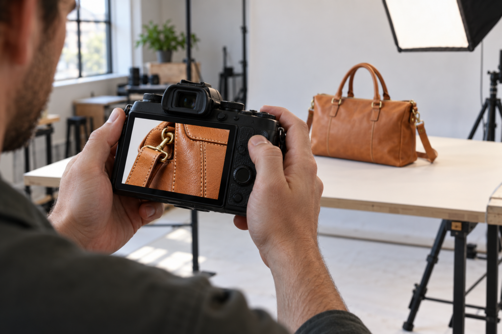
Why Image Quality Drops When a File Runs Short on Pixels
Have you ever noticed smudged edges on a homepage image, like a picture shot through a foggy window? Blur appears when an image lacks the resolution its space on your site demands.
Two situations cause the shortfall: a photo smaller than its space or a screen that packs in extra pixels.
What Happens When a Photo Is Smaller Than the Space It Fills?
The browser enlarges the picture, and every stretched pixel loses sharpness. Drop an 840-pixel image into a 1,600-pixel header, and each pixel spreads nearly twice as wide.
Colors then bleed outward and soften the edges of faces and text. Since visitors see your header before any headline, fuzzy edges hurt the user experience right away.
To avoid the stretch, ask your web team for the widest space each image fills before any upload. A full-width banner usually needs at least 1,600 pixels on a standard screen.
High-Resolution Images Need Twice the Width on Retina Screens
Even a correctly sized photo can blur on recent iPhones and MacBooks, since dense Retina displays expose weak image files. Apple uses the term Retina for screens with pixels packed so closely that you cannot easily see them individually.
Screens generally fall into two groups, and each needs high-resolution images at a different width:
- Standard Desktop Screens: Budget monitors and older laptops match each image pixel to a single screen pixel. A 1,200-pixel section on a standard display looks clear with a 1,200-pixel file. Any smaller file will start to blur.
- Retina Displays: The same 1,200-pixel image looks soft on a Retina MacBook. Apple packs about twice as many pixels into each inch, so the display needs 2,400. Recent phones go further, often at three times the density. Any photo below 2,400 pixels will appear fuzzy on Retina.
For high-density displays, a common approach is to provide an image at roughly twice its displayed width. If a banner appears at 1,600 pixels wide on your site, a 3,200-pixel-wide file will give the display more source detail to work with. Larger files can increase page weight, though, so compress them before uploading.
File Size vs. Sharpness: How Far to Compress Your Images
Compression trims detail your eye barely notices, like tiny color shifts between neighboring pixels or the fine grain in fabric. The download shrinks, and pages load faster on a customer’s phone.
For photos, JPEG is the standard format, and every JPEG relies on lossy compression. The export setting decides how much detail you give up for a lighter file. In the export panel of Photoshop, Lightroom, or Canva, set JPEG quality between 70% and 85%. The trimmed data will stay invisible on most phones and laptops.
If you push the slider below 60%, blocky patches will start to appear. You’ll usually spot the damage first in skies and sunsets, where smooth color breaks into visible stripes.
Worth Noting: Keep the original file and compress a copy. Repeatedly opening and resaving a JPEG can introduce additional compression artifacts.
Which File Type Keeps Your Photos, Logos, and Icons Sharp?
JPEG isn’t the best pick for every job. The right file type depends on the image, since photos need smooth color shifts and logos need defined edges.
The table below compares five common web formats and what each handles best:
| Format | Best For | Weak Spot |
| JPG / JPEG | Photos and colorful shots | Lossy compression softens fine lines. |
| PNG | Screenshots and graphics with transparency | Heavy for full photos |
| WebP | Photos and graphics on modern sites | Older editors may reject WebP. |
| SVG | Logos and icons | Poor fit for photos |
| GIF | Short, simple animation | Limited to 256 colors |
Google’s WebP documentation reports that WebP files run between 25% and 34% smaller than comparable JPEGs at the same visual quality. Chrome, Safari, Firefox, and Edge all support the newer image format.
WebP solves the speed problem for photos, but logos face a sharpness problem instead. A low-quality JPEG adds grey halos around the lettering, and lossy WebP can soften thin strokes too.
SVG images keep every letter crisp at any size (the format draws shapes from coordinates, so there are no pixels to stretch). If your only logo file looks fuzzy, Emaglink’s graphic designers can rebuild the mark as an SVG.
That said, the right format won’t save a photo whose shape clashes with its frame on the page.
Image Size vs. Layout: Why Your Site Crops and Resizes Photos
Most website layouts use fixed-shape slots, like product thumbnails or wide hero sections. Match each photo to its slot, and you’ll decide what stays visible. Skip the match, and your site will either crop the edges or resize the image.
Let’s walk through both outcomes, starting with cropping.
Automatic Cropping Can Cut Off Faces, Products, and Text
Picture your team photo on the homepage banner with everyone’s foreheads sliced off. Tall portrait shots cause the trouble, since a wide banner trims the top and bottom of each shot, often right across the heads.
On the flip side, a landscape image in a square product card loses its left and right edges, including any packaging text.
Both crop problems start behind the camera. If your photographer frames a product edge to edge, the layout will have nothing left to trim except the subject. So ask for extra space around every subject, and each crop will leave the focal point intact.
How Responsive Resizing Serves Smaller Images to Phones
Your site’s server keeps smaller copies of every image and sends each device the size closest to its screen width. A phone might get a 600-pixel version, while a desktop pulls a 2,000-pixel copy.
The lighter versions load faster on mobile data, so shoppers on a 4G connection wait less. With width and height attributes on each image, your theme holds space open on the page before the picture arrives.
For WordPress sites, the platform creates the smaller copies by default each time you upload a photo. On custom builds, the Emaglink team sets up device-sized copies too. You add a single image, and phones, tablets, and desktops each receive a version sized for the screen.
Resizing can only shrink what you hand over, though, so your original has to match the largest size the page will display.
Three Files to Request From Your Photographer Before Sharing Images
Resizing, compression, and cropping all work from the original photo your photographer delivers. A clear request before the shoot saves your designer from stretching, trimming, or rebuilding images later.
Before your next shoot, request these three files from your photographer:
- Full-Resolution Originals: Ask for full-size JPEGs at least 3,200 pixels on the longest side. For landscape shots, the longest side is the width. Copies from social media platforms fall short, since Instagram resizes feed photos to 1,080 pixels wide (and once a platform compresses a picture, nobody can restore the lost detail).
- Landscape and Square Crops: A single shot rarely fits both a wide banner and a square product card. Ask for different images of your best scenes in both shapes, so every frame on the page gets a matching crop.
- Logos in SVG Format: An SVG logo stays clear in a tiny browser tab, a full-width header, and even print jobs like signage. The same SVG on every page protects your brand consistency. Your branding designer usually holds the SVG if your photographer doesn’t.
In our experience, designers finish image work faster when all three deliverables arrive before the build starts. Still, a final check on your live pages will catch any blur or oversized file the export missed.
How to Keep Image Quality High on Every Screen
All in all, blurry website pictures trace back to four causes you can now spot and fix yourself. Start with your homepage, since the header and hero photos form a visitor’s first impression.
Run the page through Google PageSpeed Insights this week. The report will list every photo larger than its display size, with an estimated saving beside each image. Send the list straight to whoever manages your site.
Once you start creating optimized, high-resolution images for every section, your pages will look polished on every screen your customers use.
If you’d like help with the flagged files, contact Emaglink, and our designers will resize, compress, and reformat each image.